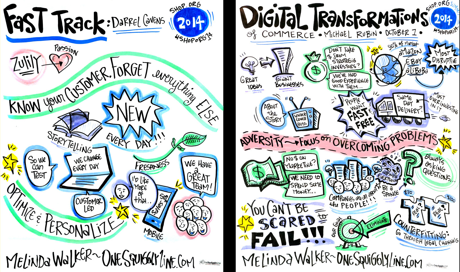
Great speakers often pepper their talks with catchy, memorable phrases that are highly quotable, and in turn, tweetable. Somtimes, those juicy gems are clearly a planned part of their presentation. Other times, they're spontaneous responses to audience comments and questions. Either way, grab those great quotes when you can! Often too quick or abstract to illustrate in mere seconds, snappy quotes are just right for some strong, fancy, and fun lettering.
Whitespace: Why Some Graphically Recorded Images Have More Than Others
Every graphic recorder, illustrator, artist, etc. has their own style and preferences for the amount of white space left on the page. But when it comes to live graphic recording, two other things determine the amount of white space far more than style alone: Time and content.
The two generally (but not always) go hand in hand. Longer talks and presentations generally cover more content, and more content means there's more stuff to fit on the page. That, in turn, leads to less white space. The reverse is true, too. Shorter talks cover less content, which means there's less to fit on the page, resulting in more white space.
Take a look at the images above. Both were created at the same conference. The one on the left was created during an 11 minute presentation. The one on the right was created during an hour long presentation. See what I mean?
What Does 3 Days of Live Graphic Recording Look Like?
Ever wonder what to expect from 3 days of live graphic recording? Each event is different, as well as the reasons for having the event graphically recorded, so no two events turn out exactly the same. But this Flickr album will give you an idea of what can be done. It represents three full days of live graphic recording on flip-chart paper for the Shop.Org Summit in Seattle earlier this month. Images like these are great for social media!
Get 'em Excited - with Visuals!
Get people excited about your event weeks in advance with some friendly visuals. Visuals like this are ideal for social media and are highly sharable. They also set a very fun and festive tone before anyone sets foot on site. And, if a graphic recorder will be capturing the event live, pre-event visuals give folks a taste of what's to come.
Check out the whole 10 image pre-event set for the Shop.Org Summit, held in Seattle last week.
Graphic recording...2 years after the fact?!?!
Live graphic recording is great, but so are visuals created before or after the fact. Like this one, which was created earlier this year - 2 years after the original presentation! A fresh visual can breathe new life into an old topic. Not that this topic is old (far from it!) but you get the idea. Visuals simply bring things to life, no matter when they're created.
Draw Something!
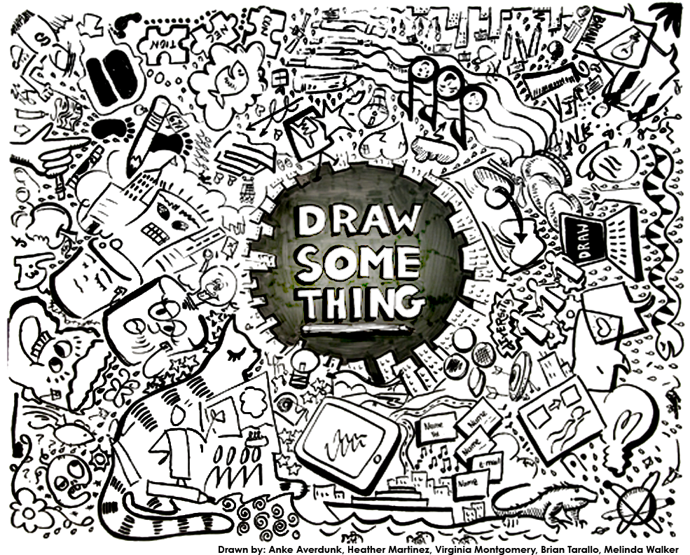
One of my highlights of 2013 was creating this collaborative recording of insights from the International Forum of Visual Practitioners Big Apple 2013 conference with fellow visual practitioners Anke Averdunk, Heather Martinez, Virginia Montgomery, and Brian Tarallo. So fun!


