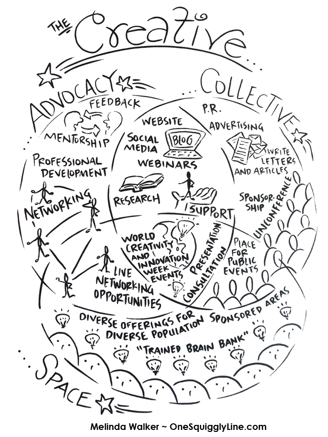
Hand-drawn visuals are far friendlier than standardized fonts and stock photos. And hand-drawn visuals are even more inviting when created live, right there where everyone can see.
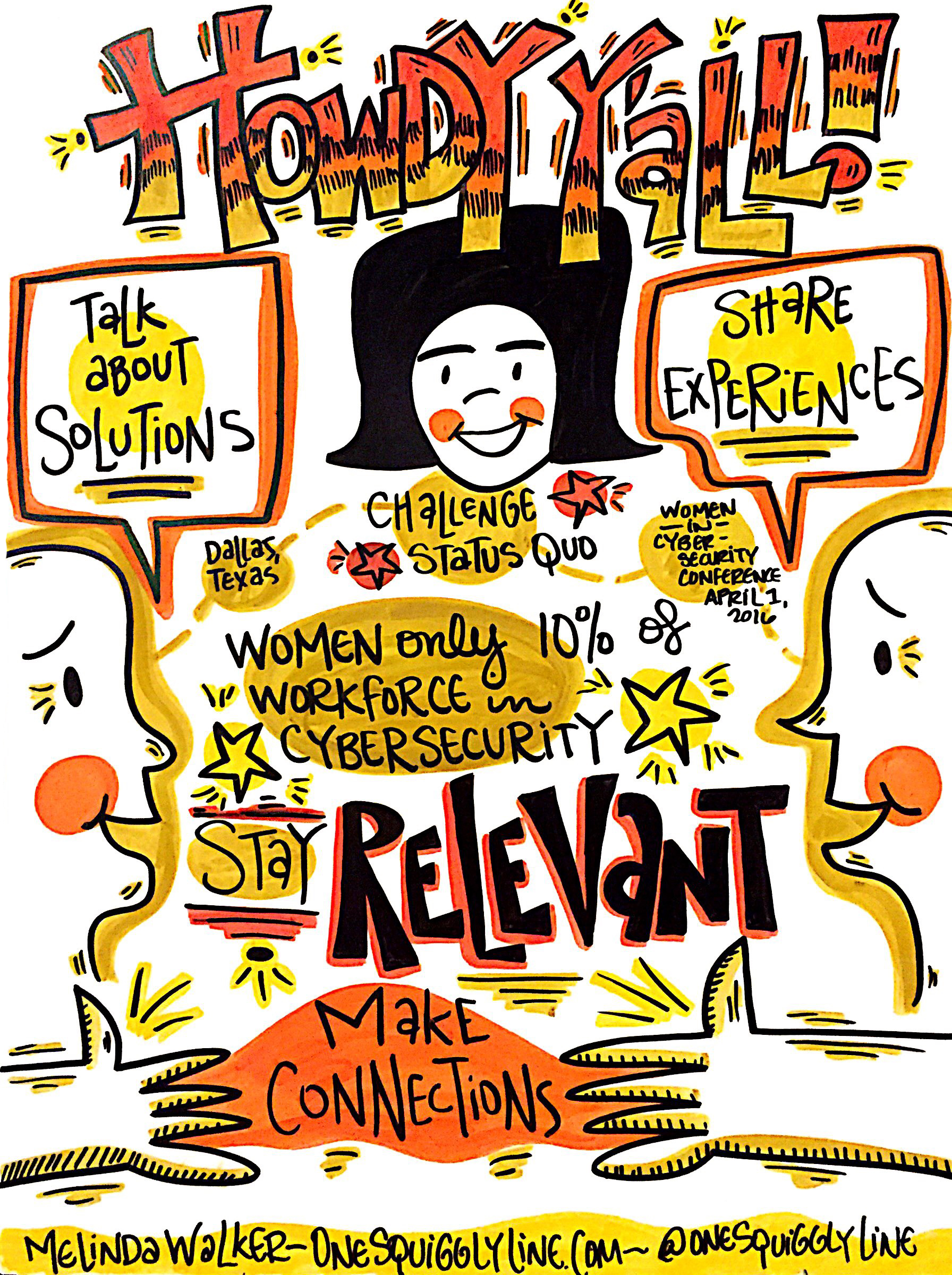
The drawing above was created during the opening remarks at the Women in Cyber Security conference the end of March. It was then displayed near registration to welcome late-comers. Not a high resolution file shown here, just taken with my iPhone in the moment.
To see the whole set of visual notes from the Women in Cyber Security conference, check out this Flickr album.
Visual Thinking & Creativity: From random to unified - find the link!
One great way to come up with more creative ideas is combine things in new ways. Often, the more random or unrelated the things combined, the more creative the idea seems to be. But in the eyes of the creator, those things probably aren't so random or unrelated after all. Where most people see randomness, the creator spots a clear connection, a unifying link.
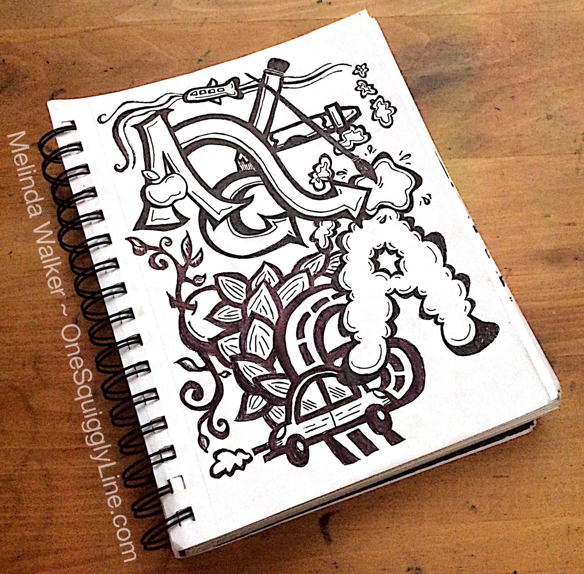
Unifying links can be found between pretty much everything, if you look deep enough. Visuals can make those links much more obvious than words alone. Try it out with the ten things pictured in the image above: Apple, airplane, airstream, art, arrows, almonds, apricot, automobile, avenue, atmosphere. Need a hint? The answer is in the picture - four times!
Visual Thinking & Meetings: Why ARE We Here?
Why bother to have a meeting if nobody knows why they're there? And they're still wondering what that meeting was all about after they left? Sometimes, all it takes is a simple visual to make things crystal clear. Visuals can remind those in charge to state the objectives and make sure everyone understands them before work begins. Visuals can also remind people to ask questions when things aren't so clear. And if someone's mind wanders, just looking at that visual will bring them right back into your content.
Pre-Event Visuals: Why Bother?
Email vs. a handwritten note. Wonder bread vs. homemade bread. Spaghetti-O's vs. homemade spaghetti. Clothes off the rack vs. clothes tailored to fit.
There's a difference. A big one. And people notice. Handmade things with a personal touch are almost always preferred to the mass produced.
Hand drawn pre-event visuals (like the one above) are much warmer and friendlier than the standard computer generated visuals most folks use. And they can support your branding just as much as those slick and glossy computer generated prints.
Synthesis Images: What Are They?
Who would want a synthesis image and why? Any number of folks for any number of reasons! Companies, nonprofits, or businesses like them to sum up lengthy reports. Website owners like them to show what their website has to offer in a glance. Educators use them to give the big picture of their topic. Professionals use them to showcase their experience...the list goes on!
No matter who uses a synthesis image or why, social media loves them! So if you're looking to draw people into your content, try a synthesis image.
Graphic Recording & Creative Lettering Design: Word Clouds
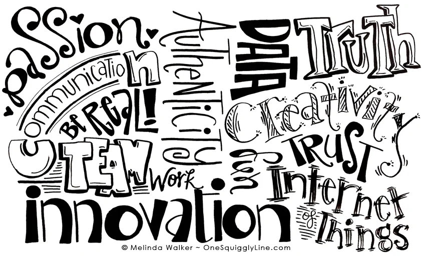
Word clouds are pretty common these days. They're usually computer generated with standard fonts. If you want your word cloud to really have impact, hand lettering is the way to go!
Hand-lettered word clouds can be created from print materials before or after and event. Or for a report or website, for example. They can also be created live as a different way of graphic recording. No pictures, only words. Words that are carefully drawn and designed to create an impact greater that just a list or something computer generated.
If you relate better to words than pictures, a hand-drawn word cloud can be a great bridge to reach those who are more picture oriented. Experience the impact yourself - contact me to create one for you!
Visual Thinking & Drawing: Make Some Posters!
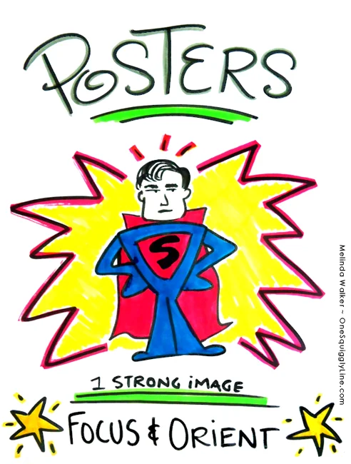
Visuals set the stage before people even walk in the room. When people are greeted by a fun and friendly poster, it makes them feel welcome. And puts them in a more positive mood. They know, before anyone has said a word, that you've put some thought into the gathering...and this gathering might actually be fun!
Your visuals don't need to be super elaborate. Simple can be fabulous! Just stick with one main image and a short title. If you need a subtitle, make sure it's short and put it on the bottom, under your image. Add some color and you're set!
Visual Thinking: Get Creative with Venn Diagrams
Venn diagrams have been around forever. They're everywhere these days, it seems. And they're here to stay. (That's a good thing!)
Don't know what they are? Pop into a kindergarten class and any number of kids will be glad to show you...if they remember what it's called. Better yet, just describe it: "You know that graphic organizer you use, the one with the big circles? Tell me about it!"
Venn diagrams are one of many graphic organizers used in the world of education. Graphic organizers are simply tried and true ways to organize information so you can see how things are related. They make complex information easier to understand. Even kindergarteners appreciate that!
When you add pictures to them, things get even better. Understanding deepens. Retention increases. The information is more inviting and engaging, too. Maybe even fun!
This Venn diagram was created for a presentation at a conference. It helped both the presenters and participants better understand the three separate but related parts of their program.
Get 'em Excited - with Visuals!
Get people excited about your event weeks in advance with some friendly visuals. Visuals like this are ideal for social media and are highly sharable. They also set a very fun and festive tone before anyone sets foot on site. And, if a graphic recorder will be capturing the event live, pre-event visuals give folks a taste of what's to come.
Check out the whole 10 image pre-event set for the Shop.Org Summit, held in Seattle last week.

