Pictures are obviously a big part of visual thinking. So are words. But if you just throw a bunch of words and pictures on a page, you just end up with a mess. A visual mess that makes your thinking messy, too.
That's where organization comes in. It's the third essential component of successful visuals. It doesn't have to be fancy. In fact, it's often best to keep things really simple.
A timeline is a simple and effective way to visually organize information.The image above shows a simple timeline of the International Center for Studies in Creativity, where I got my master's degree. Of course there's a whole lot more to their story than shown in this timeline, but it includes the things that influenced or impacted me in some way. You get the idea, at a glance.
Check out One Squiggly Line's About Visual Thinking page to learn more.
Visual Thinking & Live Visual Notes: Graphic Recording
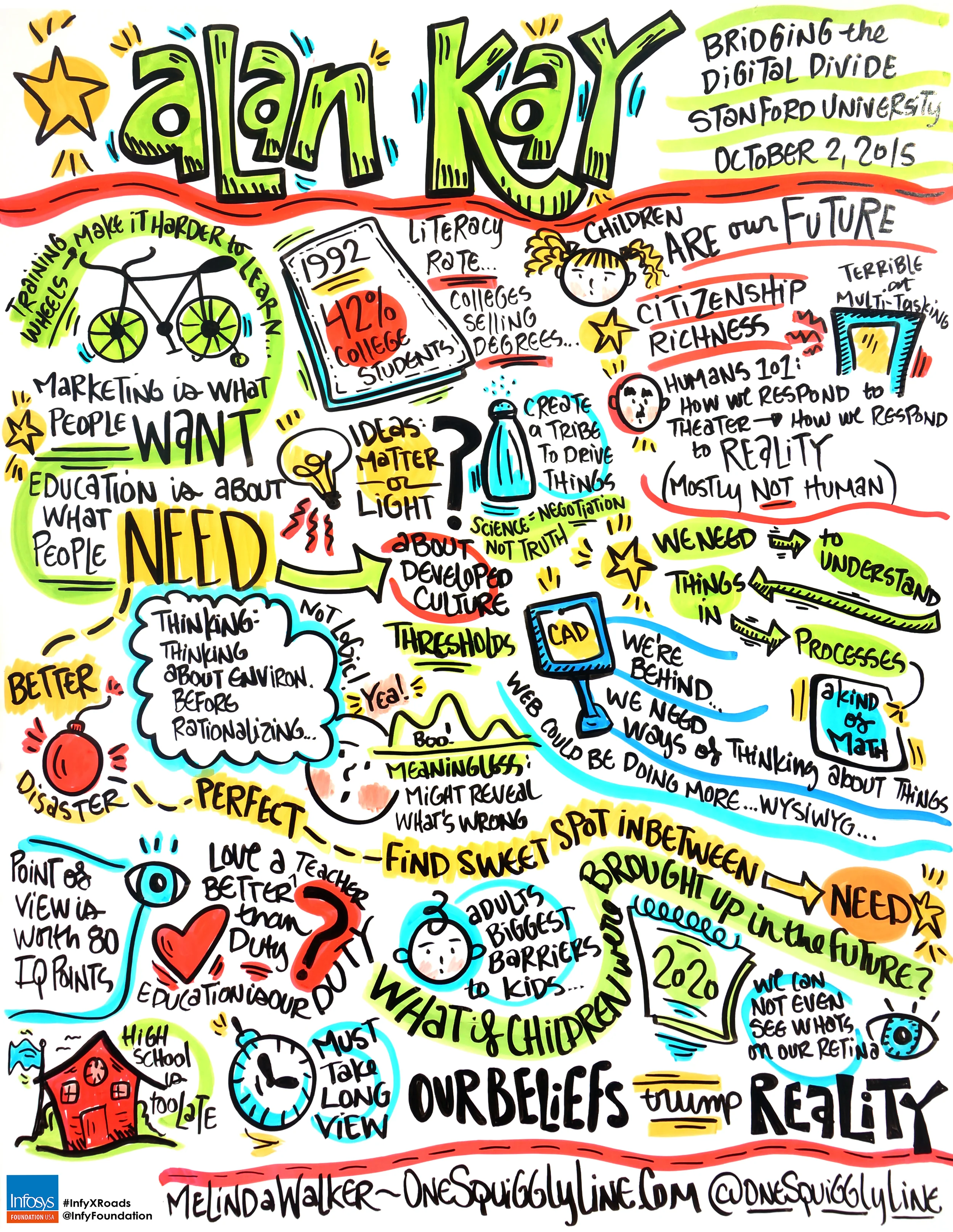
When working live, you never know what's going to happen. I usually only have the same information the people in the audience have, which is a basic agenda. So I know the speaker's name, title of their talk, and how long they are scheduled to speak. That's it!
It's not uncommon for talks to go longer as planned, like the one above. That's usually a good sign, as it means the audience is really engaged. But it can be a challenge to capture all that extra content on the same page.
Color is a great way to keep things organized when there's not much space available. Grouping concepts and thoughts according to color allows you to have completely different ideas right next to each other without things getting confusing.
See more visual notes created live at One Squiggly Line's graphic recording page.
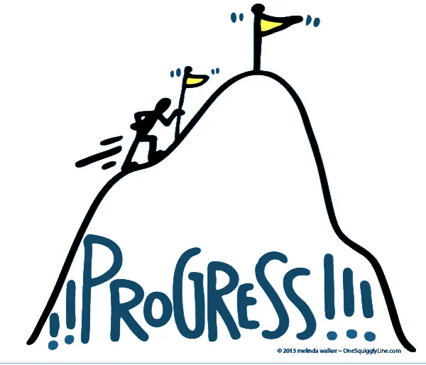
Spot Illustration: A One Word Story
Spot illustrations are simple drawings that illustrate one simple concept or word. (That's how I define them, anyways!) Often, spot illustrations turn that concept or word into a simple story. And, as anyone in marketing, sales, communication, and pretty much any other type of business knows, stories are where it's at.
Stories grab attention and draw people in. They make people curious and give them a reason to care. They can bring personal meaning to technical explanations. Stories bring things to life. Even if only a tiny glimpse of the story is told.
That's what spot illustrations do. They bring things to life and give just a glimpse of a story. Enough of a glimpse to grab attention, draw people in, and make them curious enough to find out how the story ends.
Contact me to have some hand-drawn spot illustrations created especially for you!
Sketchnotes: Make online learning much richer!
Sketchnotes keep people engaged with your content in a whole new way. They can literally give students the big picture of each lesson or the course as a whole. Presenting information in new ways allows people to think about that information in new ways, too. And that's often when real learning takes place.
The sketchnote above was created from an audio file from one lesson of The Business Soul Sessions by Beth Kempton and Kelly Rae Roberts. They packed a lot of info into a very short talk! With the sketchnote displayed where students can look at it while listening to the file, students are much more likely to remember much more of what they just heard.
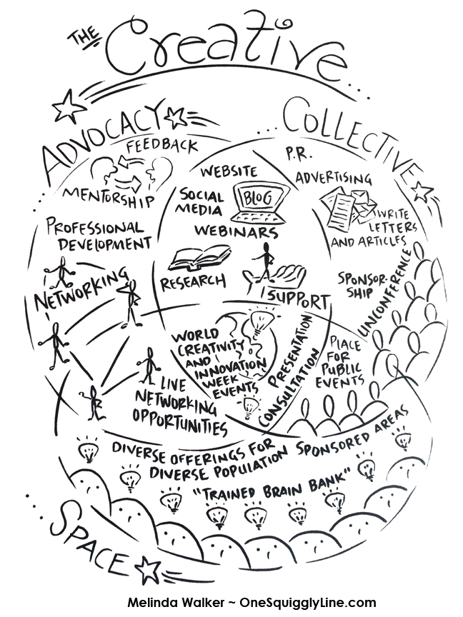
Visual Thinking: Get Creative with Venn Diagrams
Venn diagrams have been around forever. They're everywhere these days, it seems. And they're here to stay. (That's a good thing!)
Don't know what they are? Pop into a kindergarten class and any number of kids will be glad to show you...if they remember what it's called. Better yet, just describe it: "You know that graphic organizer you use, the one with the big circles? Tell me about it!"
Venn diagrams are one of many graphic organizers used in the world of education. Graphic organizers are simply tried and true ways to organize information so you can see how things are related. They make complex information easier to understand. Even kindergarteners appreciate that!
When you add pictures to them, things get even better. Understanding deepens. Retention increases. The information is more inviting and engaging, too. Maybe even fun!
This Venn diagram was created for a presentation at a conference. It helped both the presenters and participants better understand the three separate but related parts of their program.
Visual Thinking Template: Evaluation Matrix
Visual thinking helps to make things clear. It's really important to see all options clearly when it comes time to make a decision. A matrix is a great (and easy) way to make it clear how your options stack up.
To use, write the names of four books at the top (by each of the four books!). Write your criteria in the boxes on the left. For example, "Is the topic interesting to me?" "Do I understand most of the words?" Use a happy or sad face to answer each question about each of the four books. Then it's easy to see the book that best meets the criteria - it has the most happy faces.
This evaluation matrix was created for use in elementary classrooms but can easily be adapted for adult use.
Visual Thinking: Drawing Makes You Really Look
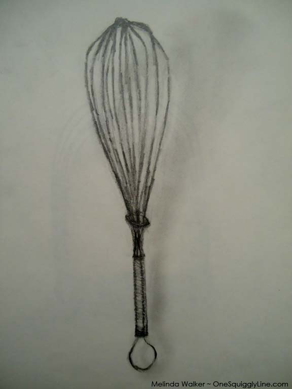
Visual thinking is most often associated with commercial, fine, or industrial arts. But visual thinking plays a big role in science, too. Before cameras and computers, scientists would draw whatever they were studying because, in the words of Ralph Waldo Emerson, "Many go through the meadow, but few see the flowers in it."
Drawing forces you to really look at whatever you're drawing. The more closely you look, the more likely you are to see things you or others may have missed. To become a better visual thinker, draw something!
The whisk above is another page from my high school sketchbook.
Sketchnotes: Published!
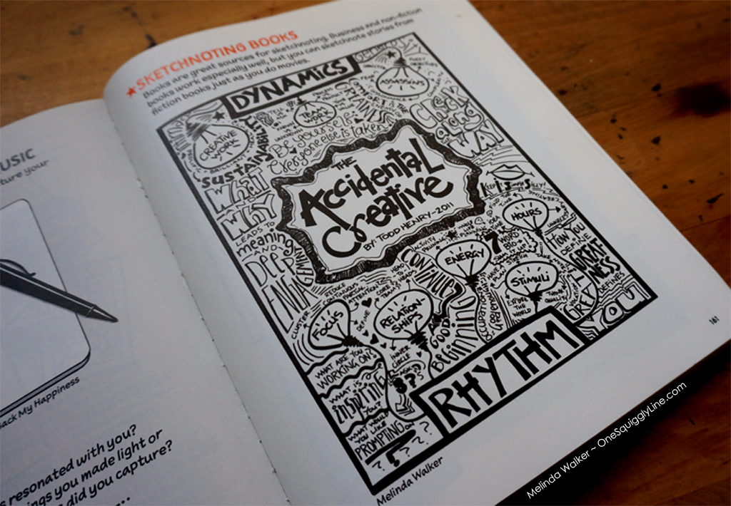
How does a very visual person write an academic paper? Visually, of course! This was the first page of a book review created as part of my master's program. While it has yet to appear in any scholarly journals, it has been published in something way more fun - The Sketchnote Workbook, by Mike Rohde.


