It probably comes as no surprise that cheerful, happy visuals can put you in a cheerier mood. Or make you crack a smile at the very least.
What may come as a surprise is that cheery visuals impact more than mood. And that impact differs between men and women. Men experience a greater drop in anxiety than women do when looking at a happy picture. Women, on the other hand, experience a greater boost in their working memory than men do when faced with a cheerful picture.
Check out One Squiggly Line's About Visual Thinking page to learn more.
Visual Thinking: Adopting New Perspectives
I took an Uber home today and the driver dropped me off at a location near my apartment that I’m not used to getting dropped off at. Initially I was a bit frustrated because I had to walk a couple yards further than normal.
But, as I was walking, I started to appreciate it because it gave me a new perspective that I needed at the time. It was mid-week, and I had been going through my same routine without too much thought - wake up, go to work, go home, etc. This small instance changed my mindset for a moment and bumped me out of my normal routine. The scenery had changed, and I saw my apartment from a new perspective which I hadn’t seen before.
This brought me back to when I first moved here. To my mindset, and to the excitement I had. I felt different, as if I adopted a new pair of lenses. My day felt different from the other ones, and it got me thinking that I need to break more patterns.
So I decided to go to the gym. I also sat on the bench at my apartment, peacefully enjoying nature. And I prayed for the first time in awhile.
I decided to break up my usual routine, and instead fill it with new perspectives.
It was refreshing.
I didn’t feel so robotic. I felt alive.
It’s important to change our routines from time to time. New perspectives bring forth creative thinking patterns.
If we stay on the same path everyday, chances are we’ll tend to have the same thoughts as we’ve always had. If we don’t evaluate our lives on a regular basis, we can easily fall into the trap of forming habits that are not conducive to a creative life.
We must evaluate and edit our lives on a frequent basis.
“The only thing you sometimes have control over is perspective. You don't have control over your situation. But you have a choice about how you view it.”
-Chris Pine
bring visual thinking to your next project or event
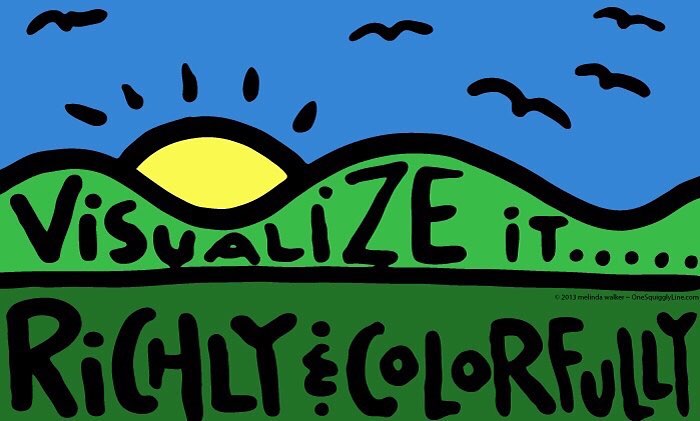
Visual Thinking & Creativity; Visualize it richly & colorfully
Visualizing things richly and colorfully leads to more creative thinking. You probably visualize things more than you realize, without really thinking about it. So you already have some visual thinking skills. But how do you become better at visualizing things on purpose?
Try this:
Go to a hardware store or someplace that sells paint. First, pick a paint sample color card that matches your shirt. That's a warm-up, starting with something very concrete and right in front of you — your shirt.
Then, look for a paint sample color card that matches something at home. It could be a different shirt, a piece of furniture, your walls. Whatever you choose, you will need to picture it very clearly in your mind so you can "see" the color.
Paint sample cards are usually free, so you can take home the ones you think are the closest and see how well you did. The more you practice, the better you get!
Check out One Squiggly Line's About Visual Thinking page to learn more.
Visual Thinking: Simple as 1-2-3!
One of the most powerful things about visual thinking is that it makes things simple. When things are simple, they're much easier to remember. And the more often you see something, the more likely you will be to remember it, too.
That's why simple posters are so powerful when working in person. And why simple online visuals are so powerful before and after events, or when you can't be face-to-face.
A super simple way to keep your visuals super simple is as easy as 1-2-3. Choose 1 central image. Use no more than 2 colors. And limit yourself to only 3 words. That's it!
That formula doesn't always work for everything, but it's a great place to start. Even if you have to sneak in an extra word or two, your visual will still be pretty simple.
Visual Thinking & Creativity: Keep it Posted!
When people look at things, they generally think about whatever they're looking at. So if you want to be sure people focus on certain things during your meeting or presentation, visuals can really help.
Posters are a great way to keep that info front and center in everyone's mind. Your posters don't need to be fancy. But they do need to be clear. Very clear. So clear people can get the info in a glance.
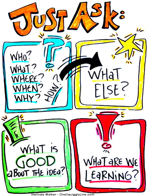
The poster above was created for a workshop I taught about thinking styles. It was used during a hands-on group activity to remind each group to try out all four thinking styles. The thinking styles are color coded, so it's easy to focus only on one square at a time. Yet, it gives a clear picture of the whole process. That way, people can move about the process at their own pace and see how they're connected.
Visual Thinking: Graphic Recording
There's more than one school of thought when it comes to graphic recording. Some say to use as many pictures as you can. Others say to capture as many words as you can. I tend to fall somewhere in the middle, I think. Well, really, I don't think about it too much. I just do what makes the most sense. Whatever captures the idea best. And visually makes the most sense.
This is a graphic recording I did for practice quite a while ago. It's pretty heavy on the words. Not so many pictures. How the words are arranged on the page and the different colors and sizes make it much more visually interesting than regular writing.
As you can see, amazing drawing skills aren't needed to create visuals with impact!
Visual Thinking & Drawing: There's Power in Numbers!
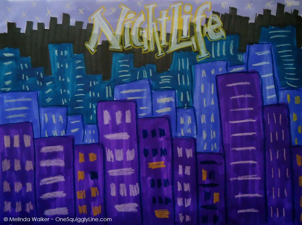
This is by no means the most exciting drawing out there. But it's a great example of how simple shapes and lines can turn into something far more powerful.
The entire city is made of rectangles. Simple lines make up the windows. The stars in the sky are just the letter x. That's it!
The way everything is put together is what makes those simple lines and rectangles turn into a city. They fill the page. That creates far more impact than one building alone. And the dark colors make it clear it's night time.
Next time you want to make a simple drawing more powerful, try filling the page with the simple things you do know how to draw.
Graphic Recording: Great Drawing is not the Secret!
Graphic Recording is all about communication. There's definitely an art to it. But it's so not about art! Knowing a few things from the art world can certainly help, though.
Look at the graphic recording above. There's barely any drawing in it - some generic buildings, a few arrows, and a star. That's it! This image is mainly text. And some of that text is even a bit sloppy.
Yet, the image has impact. The impact comes from a few bold words and the bright orange color. Even with a lot of text, there's a sense of movement and balance. Thanks to how things are arranged on the page (the composition).
Bad composition makes people uncomfortable. Good composition draws them in. That's why great drawing is not the secret to creating great visuals. Great composition is really where it's at.
This graphic recording was created while listening to a pre-recorded TED talk, using one black and one orange marker.
Visual Thinking & Creativity: 17 Umbrellas
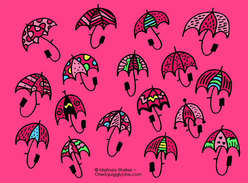
It's been raining a lot here lately (we need it!) so I decided to draw some umbrellas...and make them all a nice, bright sugary-sweet pink!
It's the same simple umbrella shape over and over again. But each one has it's own unique pattern. Some I like. Some I don't. But even the ones I don't like so much look OK mixed in with all the others. That's because they're unified by the basic umbrella shape.
When you take one idea (like an umbrella) and change one thing about it (like the pattern) you can come up with a lot of ideas super fast. Just be sure to keep all the ideas, including the ones you don't like. Those icky ideas often lead to good ones later on.
Graphic Recording: Color & Lines Create Movement
People will often come up to me on live Graphic Recording jobs and say, "Wow, I sure wish I could draw like you!" That's a really nice compliment. But the truth is, most people really can draw most of the things they're looking at. The "wow" factor comes from the design.
Take the graphic recording above. There aren't many pictures here - some simple faces, a few dollar bills (rectangles with dollar signs on them), and a bunch of mosquito type things that could be any kind of flying insect. Nothing fancy!
What grabs people's eye and draws them in is the design itself. In between the bold lettering on the top and bottom are a bunch of powerful lines and strong colors. The bold lettering frames the page and keeps it grounded. The powerful lines direct your eye around the page so you're sure to look at everything. The strong colors direct your eye, too. They also organize the information so you can more quickly understand how it's related.
If you only look at the pictures, you know the talk had something to do with bugs, people, and money. The design itself is what invited you to dig a little deeper and make sense of it all.
This graphic recording was done as an experiment, using only a black marker and crayons. I discovered crayons tend to disappear when you make the background white. That's why I left the image as is - with a blotchy gray background. That doesn't happen with markers!


