Hand-drawn visuals are far friendlier than standardized fonts and stock photos. And hand-drawn visuals are even more inviting when created live, right there where everyone can see.
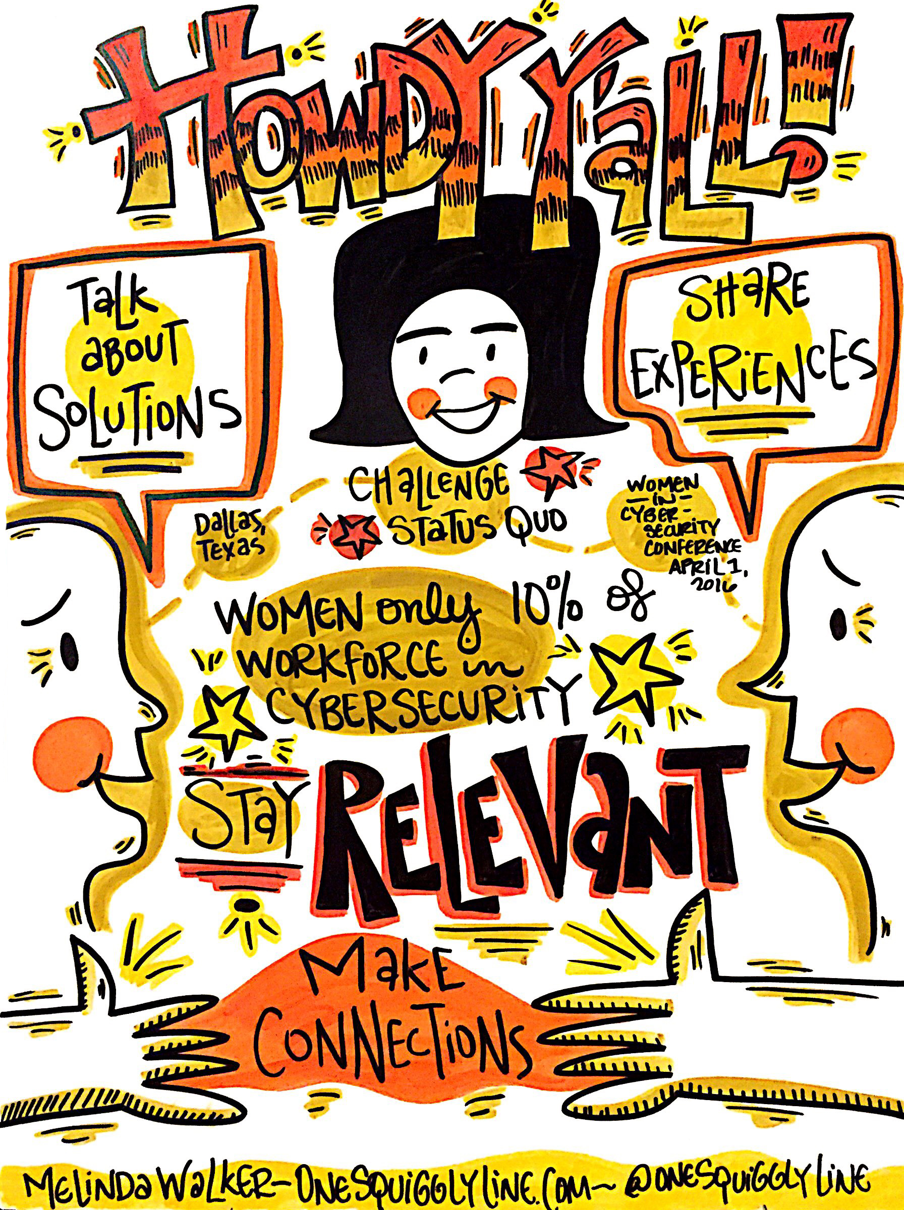
The drawing above was created during the opening remarks at the Women in Cyber Security conference the end of March. It was then displayed near registration to welcome late-comers. Not a high resolution file shown here, just taken with my iPhone in the moment.
To see the whole set of visual notes from the Women in Cyber Security conference, check out this Flickr album.
Visual Thinking & Visual Notes: Live Graphic Recording
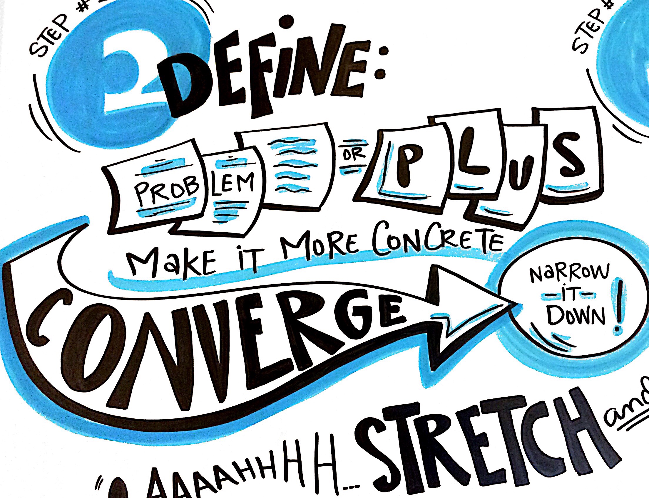
People often think I do a lot of drawing while taking live visual notes. If you really look at the image above, you'll see there's really not much drawing there at all. Just some squares, a couple of circles, and an arrow. That's it!
When you write words inside simple shapes, those simple shapes start making your own notes a bit more visual. They become more dynamic. More interesting. The image and the message become more unified. And far more powerful.
A great way to make your own notes more visual is to write some of your words inside simple shapes — circles, squares, triangles, arrows, etc. Give it a try!
The image above is a close-up of a 4'x8' drawing, created live, in real-time during a Design Thinking workshop. Be sure to check out the entire image!
Sketchnotes: Make online learning much richer!
Sketchnotes keep people engaged with your content in a whole new way. They can literally give students the big picture of each lesson or the course as a whole. Presenting information in new ways allows people to think about that information in new ways, too. And that's often when real learning takes place.
The sketchnote above was created from an audio file from one lesson of The Business Soul Sessions by Beth Kempton and Kelly Rae Roberts. They packed a lot of info into a very short talk! With the sketchnote displayed where students can look at it while listening to the file, students are much more likely to remember much more of what they just heard.
Graphic Recording: Use those visuals after the event!
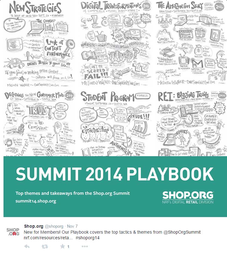
Graphic recording happens live, in real-time and on a large scale right in front of everyone. That's part of what makes it so powerful, engaging, and memorable. But those images can be quite powerful, engaging, and memorable after the event, too. So how do you put them to good use? Shop.Org had a great idea, as shown above in this Twitter screenshot.
Visual Thinking & Graphic Recording: Is Bigger Better?
Part of the power of graphic recording is that it is done live and at a large scale. The most common size is eight feel long by four feet high. Even when given the dimensions, most folks don't realize how large that is. A Smart car is about nine feet long by five feet wide - roughly a foot less in length and width than the average graphic recording surface!
Obviously, working at a scale that large is not the best option for a small meeting space. But just because the event venue is humongous doesn't meant a ginormous board is the best option. There may not be enough space to display those great big visuals for people to discuss later. And that's where a lot of the magic happens!
The image above was created on foamcore board roughly the size of flip chart paper. It's large enough for a small group to look at and discuss. Yet small enough to be easy to carry and display afterwards.
Graphic Recording: Color & Lines Create Movement
People will often come up to me on live Graphic Recording jobs and say, "Wow, I sure wish I could draw like you!" That's a really nice compliment. But the truth is, most people really can draw most of the things they're looking at. The "wow" factor comes from the design.
Take the graphic recording above. There aren't many pictures here - some simple faces, a few dollar bills (rectangles with dollar signs on them), and a bunch of mosquito type things that could be any kind of flying insect. Nothing fancy!
What grabs people's eye and draws them in is the design itself. In between the bold lettering on the top and bottom are a bunch of powerful lines and strong colors. The bold lettering frames the page and keeps it grounded. The powerful lines direct your eye around the page so you're sure to look at everything. The strong colors direct your eye, too. They also organize the information so you can more quickly understand how it's related.
If you only look at the pictures, you know the talk had something to do with bugs, people, and money. The design itself is what invited you to dig a little deeper and make sense of it all.
This graphic recording was done as an experiment, using only a black marker and crayons. I discovered crayons tend to disappear when you make the background white. That's why I left the image as is - with a blotchy gray background. That doesn't happen with markers!
Visual Thinking: Get Creative with Venn Diagrams
Venn diagrams have been around forever. They're everywhere these days, it seems. And they're here to stay. (That's a good thing!)
Don't know what they are? Pop into a kindergarten class and any number of kids will be glad to show you...if they remember what it's called. Better yet, just describe it: "You know that graphic organizer you use, the one with the big circles? Tell me about it!"
Venn diagrams are one of many graphic organizers used in the world of education. Graphic organizers are simply tried and true ways to organize information so you can see how things are related. They make complex information easier to understand. Even kindergarteners appreciate that!
When you add pictures to them, things get even better. Understanding deepens. Retention increases. The information is more inviting and engaging, too. Maybe even fun!
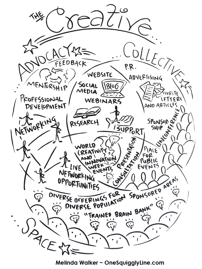
This Venn diagram was created for a presentation at a conference. It helped both the presenters and participants better understand the three separate but related parts of their program.
Graphic Recording: Mr. Sketch Markers
There's no denying it, Mr. Sketch Markers are just plain fun to use!
Each marker smells like either a fruit or spice. They're pretty easy to get your hands on, too. Most office supply stores carry them, as well as places like Walmart or Target. And they're a lot less expensive than fancy art markers.
They have a chisel tip that lets you draw thin or think lines, depending on how you hold the marker. Bold lines are great because people can see them from across the room. Thin lines are great, too, because they let you add some details for people to see when they're closer.
Back to the bold lines for a minute...
Working with big, bold lines is a great habit to get into. Whether you're working alone or with a group, bold lines make it much easier to see things. If you're planning to send pictures of any sketches electronically, bold lines will actually let people see what you've drawn. And that's the whole point, right?
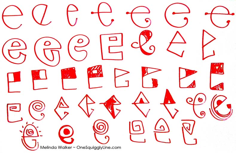
Visual Thinking & Lettering Practice: Designing Lowercase E's
Another super quick visual thinking, lettering design, and creative thinking practice - all in just 2 minutes! Just choose a letter and if it will be upper or lower case. Get some paper or whatever you're going to draw on and something to draw with ready. Set the timer for 2 minutes. Draw your letter as many different ways as you can until the timer goes off. That's it! Whatever you draw stays there - no erasing, no scribbling out. The ideas you don't like this time around may be just what you're looking for later on.
My 2 minute practice above was done on a whiteboard.
Lettering: Fill the Space!
Flowing calligraphy. Fancy script. Bouncy bubble letters. Bold block letters. They're all great but can take time to create. Sometimes you simply don't have the time.
Don't let a time crunch stop you from giving your letters some style! All you have to do is draw your letters instead of writing them. That means you really think about each line before you draw it. Also, think about how the letters fit together and look as a whole.
Your goal now is to make an eye-catching design with a message. Not to write out a word as quickly as possible. That's what computers are for!
Take a second or two to imagine how the image would look with a line in a couple of different places. Try to really see that line on the page before you draw it.
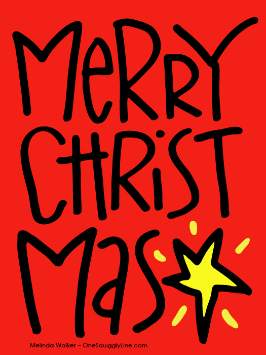
If you have a longer word, make it fill the space. Don't worry about making it all fit on one line. As long as you keep all the letters in order, people will get the message. But make it look like you broke the word up on purpose to make it look good. Not because you didn't plan ahead and ran out of room! If you have some extra spaces, fill them in with something simple related to the word. Like I used a star in mine.

