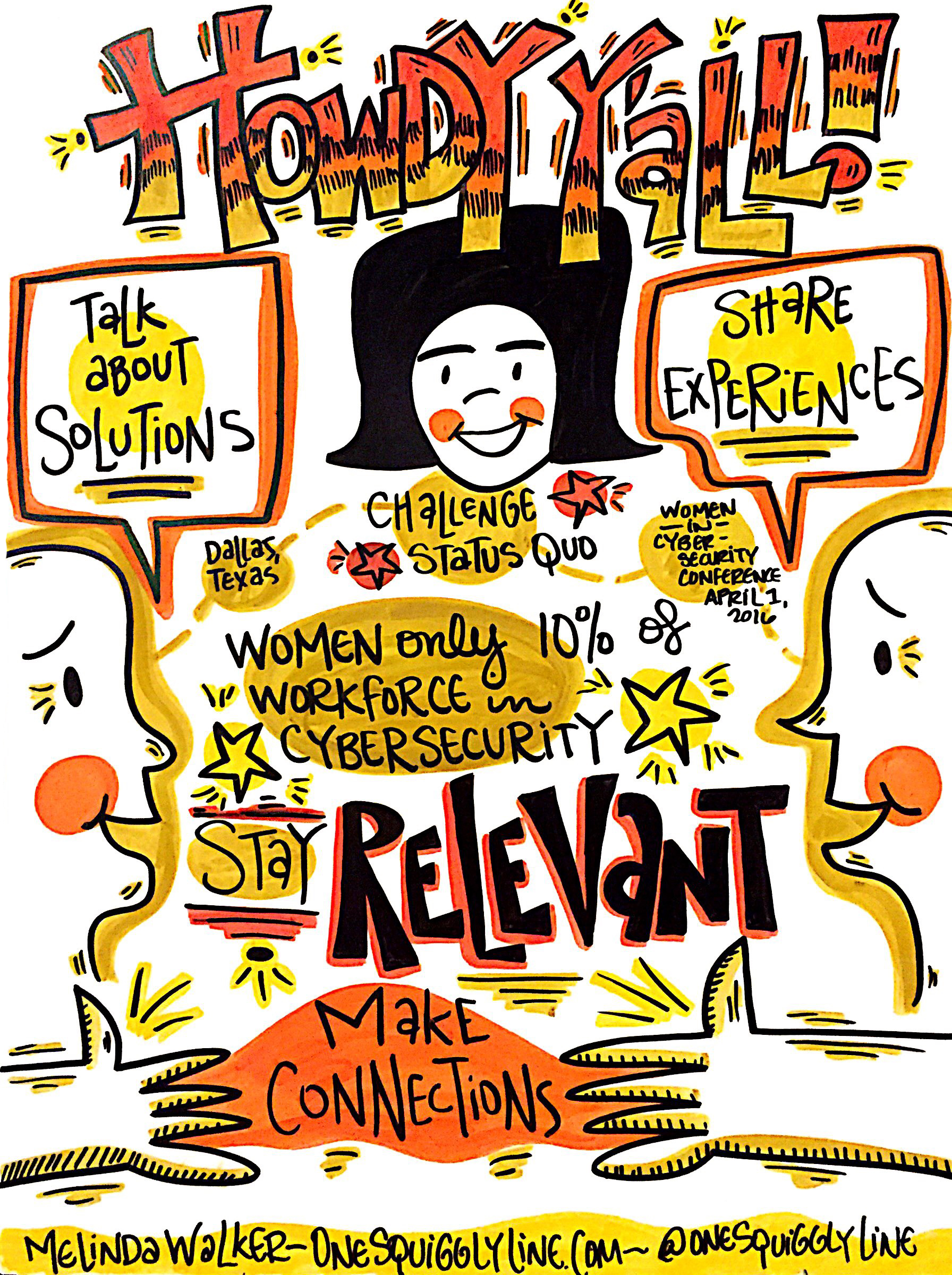
Hand-drawn visuals are far friendlier than standardized fonts and stock photos. And hand-drawn visuals are even more inviting when created live, right there where everyone can see.
The drawing above was created during the opening remarks at the Women in Cyber Security conference the end of March. It was then displayed near registration to welcome late-comers. Not a high resolution file shown here, just taken with my iPhone in the moment.
To see the whole set of visual notes from the Women in Cyber Security conference, check out this Flickr album.
Visual Thinking & Visual Notes: Live Graphic Recording
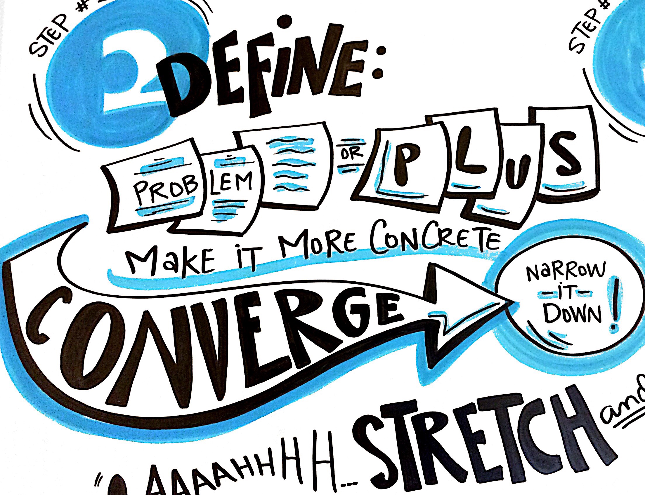
People often think I do a lot of drawing while taking live visual notes. If you really look at the image above, you'll see there's really not much drawing there at all. Just some squares, a couple of circles, and an arrow. That's it!
When you write words inside simple shapes, those simple shapes start making your own notes a bit more visual. They become more dynamic. More interesting. The image and the message become more unified. And far more powerful.
A great way to make your own notes more visual is to write some of your words inside simple shapes — circles, squares, triangles, arrows, etc. Give it a try!
The image above is a close-up of a 4'x8' drawing, created live, in real-time during a Design Thinking workshop. Be sure to check out the entire image!
Visual Thinking & Sketch Animation: One Squiggly Line
I added this quick animation to my Services page. Unfortunately, many sketch animations are confidential, created only for internal company use, so they can't be shared. But they're a great way to bring training materials, sales presentations, product highlights, or any other information to life.


