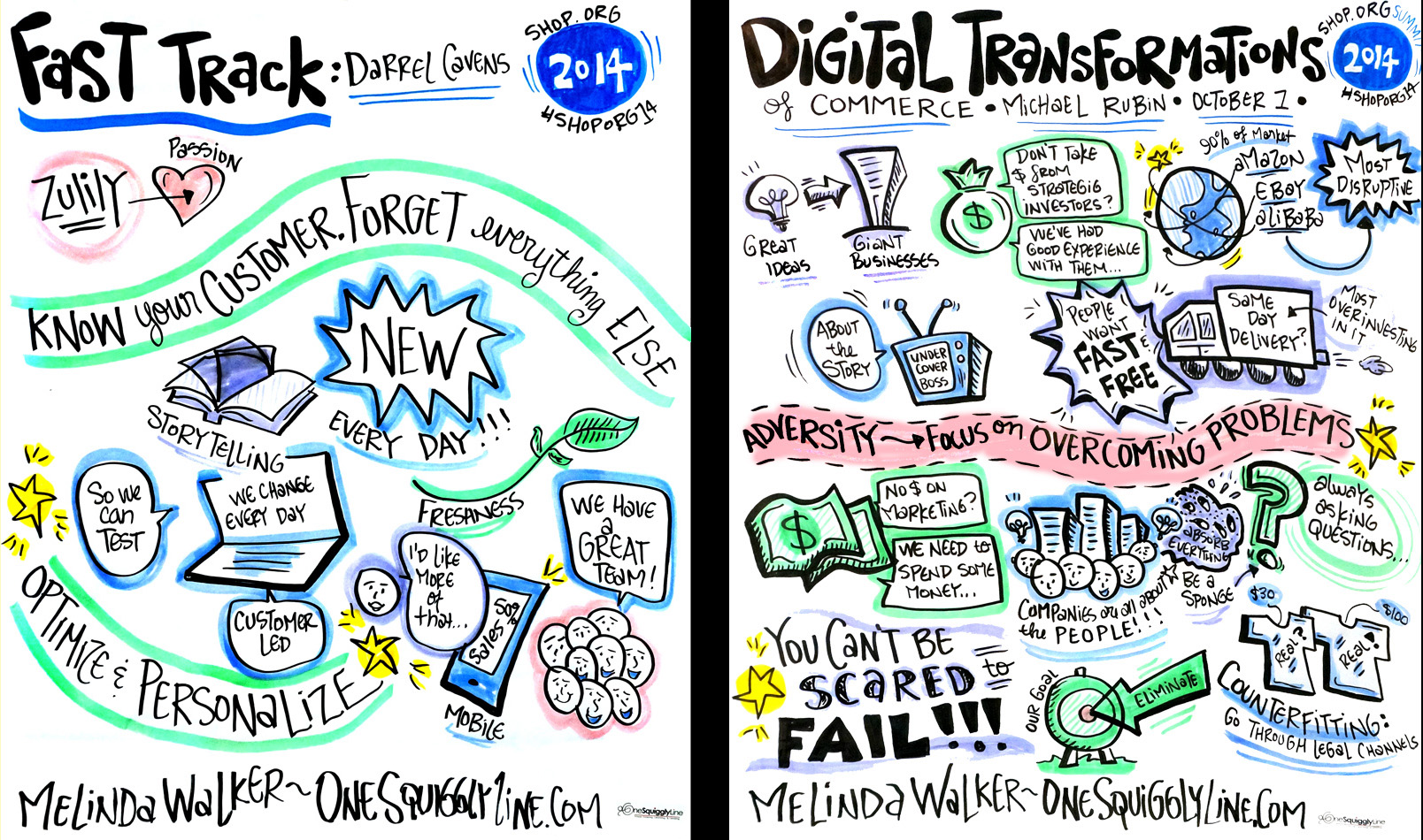
Every graphic recorder, illustrator, artist, etc. has their own style and preferences for the amount of white space left on the page. But when it comes to live graphic recording, two other things determine the amount of white space far more than style alone: Time and content.
The two generally (but not always) go hand in hand. Longer talks and presentations generally cover more content, and more content means there's more stuff to fit on the page. That, in turn, leads to less white space. The reverse is true, too. Shorter talks cover less content, which means there's less to fit on the page, resulting in more white space.
Take a look at the images above. Both were created at the same conference. The one on the left was created during an 11 minute presentation. The one on the right was created during an hour long presentation. See what I mean?

