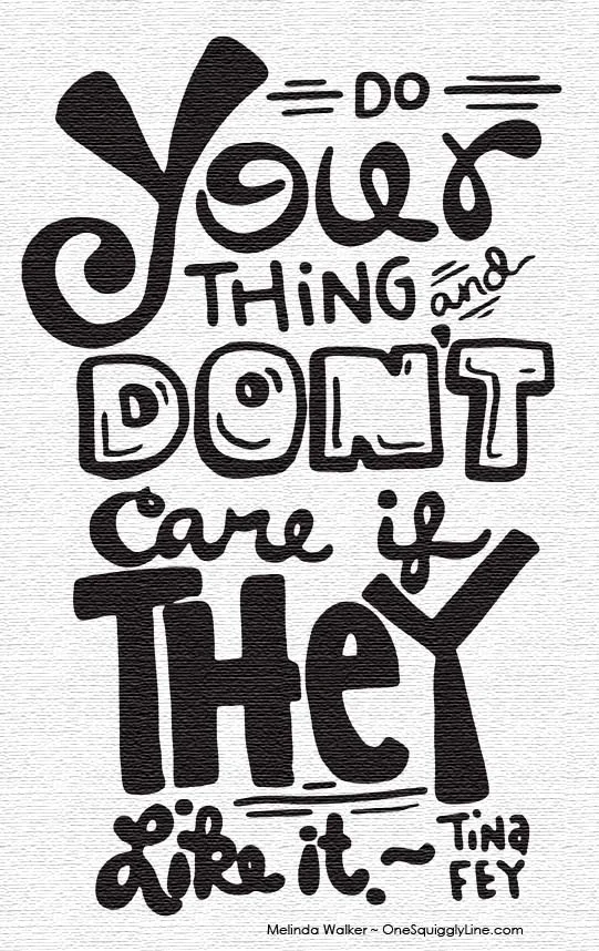
Common advice says to use no more than three different fonts or lettering styles at a time. But designers break this rule all the time. And create some pretty amazing work when they do. So, how do you know when to stick to the three typeface limit or to reach beyond?
There are a lot of reasons why or why not to stick to the power of three. For one thing, three is a great number - it gives a bit more variety than two, yet still keeps things simple. So, keeping in the spirit of threes, here are three key elements to consider when choosing how many fonts, typefaces, or lettering styles will serve you best (in no particular order):
Message - Some messages are not meant to be interesting, engaging, thought provoking, or pretty. They're just the facts, and only the facts, ma'am. Like legal documents. It would just be plain weird to have them written out in a bunch of fancy fonts. A sentence here and there in italics and some select words in bold are all the variations you need to keep the message short, sweet, and very, very straight forward.
On the flip side, if the message is fairly short and sweet, interesting, engaging, or thought provoking, then a handful of extra lettering styles may very well make your message shine just a bit brighter.
Impact - The higher the contrast, the higher the impact - visually speaking. If you want your message to be rather subtle, then stick to one font for sure. If subtlety isn't what you're after, bring out those typefaces! Of course, you want to be sure the impact you create is all positive. And that will only happen if all the letters on the page look good together. If your message ends up a jumbled mess of random lettering styles, your message will still have quite an impact. Unfortunately, a very negative one.
Speed - Multiple lettering styles work well for philosophical or inspirational quotes (like the one above) because they're meant to be thought provoking. Deeply thinking about something takes time. And if written in a bunch of different lettering styles, that quote will take much longer to read. When all words are written in a different style, you read every single word. That gives the message a bit longer to sink in. It also means you're more likely to remember it. And if the message is visually appealing, you'll want to just look at it and appreciate the aesthetics of it, too.

