Flowing calligraphy. Fancy script. Bouncy bubble letters. Bold block letters. They're all great but can take time to create. Sometimes you simply don't have the time.
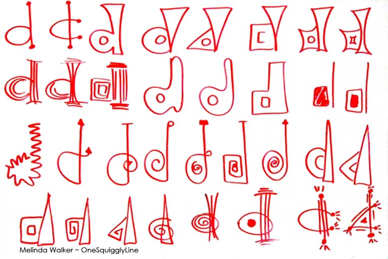
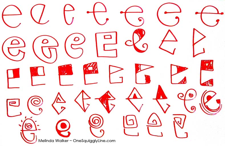
Don't let a time crunch stop you from giving your letters some style! All you have to do is draw your letters instead of writing them. That means you really think about each line before you draw it. Also, think about how the letters fit together and look as a whole.
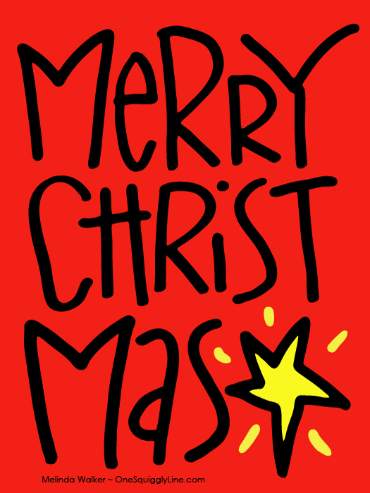
Your goal now is to make an eye-catching design with a message. Not to write out a word as quickly as possible. That's what computers are for!
Take a second or two to imagine how the image would look with a line in a couple of different places. Try to really see that line on the page before you draw it.
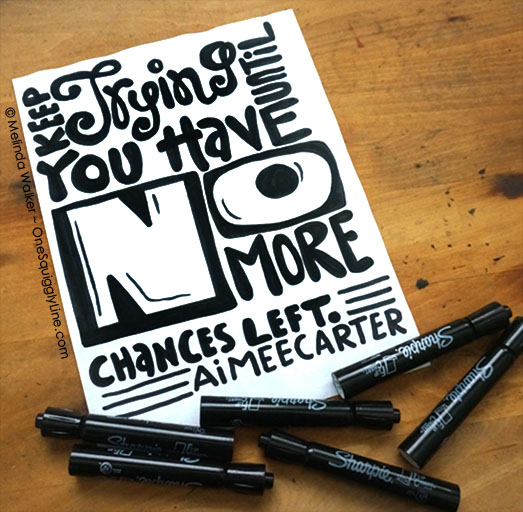
If you have a longer word, make it fill the space. Don't worry about making it all fit on one line. As long as you keep all the letters in order, people will get the message. But make it look like you broke the word up on purpose to make it look good. Not because you didn't plan ahead and ran out of room! If you have some extra spaces, fill them in with something simple related to the word. Like I used a star in mine.